
Startup failures rarely stem from a lack of brilliant ideas. They usually result from a missing clear vision. Teams frequently ignore genuine user needs during development. Data shows that ninety percent of new projects shut down. This failure happens due to weak field execution strategies. It also happens from accumulating product design mistakes early on.
I remember a harsh night in our Casablanca office near midnight. My eyes were red from staring at a busy Figma screen. The file was packed with complex design layers. An e-commerce client insisted on packing every feature into their first release. They wanted a loyalty system, a digital wallet, a chatbot, and seven extra pages. I quickly reviewed the task list in Linear. I discovered that eighty percent of these features were never requested. Users did not ask for them in early tests. I deleted them all at once. I delivered a simplified version with only three core features. The result was stunning. The store recorded three hundred twenty orders in its first two weeks. The interface became simple and clear. That experience taught me that simplicity is the strongest weapon for success.
- Avoid Fatal Product Design Mistakes: How to Simplify the MVP Without Bloat
- Verify Product-Market Fit Before Writing a Single Line of Code
- Design Frictionless Conversion Paths Using the Funnel Law
- Speed Up Feedback Loops and Avoid Vanity Metrics
- Stop Reinventing the Wheel and Allocate Resources Wisely
- Balance System Trade-Offs and Avoid Top-Down Designs
- Empower Design Experts and Avoid Destructive Solo Decisions
-
Integrate Artificial Intelligence Responsibly into User Interfaces
-
Frequently Asked Questions
- What product design mistakes destroy startups?
- How much do product design mistakes cost startups financially?
- What is the difference between successful product design and feature-bloated design?
- How do you avoid product design mistakes in your project?
- Does relying on design experts guarantee your project won’t fail?
-
Frequently Asked Questions
- Conclusion
Avoid Fatal Product Design Mistakes: How to Simplify the MVP Without Bloat

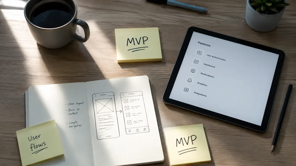
The minimum viable product is the simplest version that delivers real value. It does this at the lowest possible development cost. Disaster strikes when startups pack extra features into this first release. They do this out of excessive enthusiasm or inexperience. This rapid feature bloat drains development budgets quickly. It leaves companies without resources for necessary post-launch adjustments.
Organize Weekly Tasks by ROI to Simplify the MVP
I once used a rapid investment prioritization strategy on a past project. It protected our development budget from unnecessary waste. I strongly recommend this approach for your next launch. You will create a clear task list. You will sort it carefully by return on investment. Start by executing only your top three weekly tasks. You will instantly measure saved time and team satisfaction.
Junior designers often fall into the trap of adding random complex features. They skip feasibility studies entirely. This confusion wastes available resources and frustrates users. Focus on the core function that solves your biggest customer problem. Leave secondary details for later project stages.
Measure MVP Success with Real Metrics Like Time Saved
Measuring your initial product must rely on practical numbers. These numbers should reflect effective operational efficiency. They should also show direct revenue impact. I feel deeply frustrated when startups celebrate fake metrics. Their product actually suffers from severe interface slowness.
Simplification requires great courage. You must ditch visually appealing ideas that lack practical value. You can take direct inspiration from the Instagram platform. It began as a complex platform called Burbn. The team removed everything else. They focused only on photo sharing.
This strict focus on core value paves the way. It helps you understand true market needs before scaling development…
Verify Product-Market Fit Before Writing a Single Line of Code

Building a great product never guarantees usage. People will not use it if it ignores their daily needs. A lack of real market demand is a clear sign. It shows poor strategic planning. It also shows ignored early validation stages. Some companies rush straight into coding. They fear competitors will steal their ideas.
Track 30-Day User Retention to Confirm Viability
I once applied a product-market fit focus strategy on a tech project. It confirmed viability before heavy investment. I advise adopting this method for your team. You will track user retention rates over thirty consecutive days. You will also monitor the net promoter score. You will calculate revenue generated per user. This ensures you deliver a real and sustainable solution. Relying on founder guesses without real market data always fails. It ends with abandoned interfaces that attract zero visitors.
Test Assumptions with Users Before Launching Development
Successful product design requires continuous user experience research. This includes direct personal interviews and empathy mapping. These tools give you deep insight into target behaviors. They reveal hidden flaws in the user journey. You can catch these issues before writing any code.
Sharing early prototypes with interactive communities on Discord helps. It builds a loyal customer base. These users will feel attached to your product. You can read a deep analysis on this topic in our comprehensive guide on digital design art. It will develop your creative vision.
Understanding audience requirements simplifies interface creation. It leads directly to optimizing conversion paths…
Design Frictionless Conversion Paths Using the Funnel Law

Many products misunderstand market expectations. They force users through complex paths for simple tasks. Adding steps to any digital process automatically increases friction. This friction pushes customers to abandon your app immediately. Designers must study the real environment. They must ensure users interact with the product smoothly.
Reduce Checkout Steps to Two Pages to Boost Conversion by 15%
I once applied the funnel law during an e-commerce development project. It reduced shopping cart abandonment rates significantly. I recommend using this law for your checkout flow. You will shrink long processes into essential actions only. You will remove all unnecessary input fields.
Applying this principle helped UX experts previously. They cut checkout steps from four pages to just two. This simple step successfully raised completed store sales by fifteen percent. It is a harsh lesson for project managers obsessed with complexity.
Design User Paths Based on Real Context, Not Guesses
Interface design must consider external environmental factors. It must account for surroundings during daily smartphone interaction. The famous failure of Google Glass proves this. Ignoring social context and privacy concerns destroys any tech innovation. It does so regardless of how advanced it is.
Use interactive design tools that ensure visual clarity. They should provide comfortable color contrast under different lighting. You can read more about fixing these strategic errors in the detailed analysis on Toptal.
Careful analysis of user steps reveals weaknesses easily. But you will need to accelerate the cycle for gathering this vital data…
Speed Up Feedback Loops and Avoid Vanity Metrics

When gathering user opinions takes several months, design errors become entrenched. They get buried in the codebase. Fixing them later becomes nearly impossible. Rapid feedback is the lifeblood of any startup. It is vital for survival in a fiercely competitive environment. Many teams fall into the trap of celebrating false numbers. These numbers do not reflect true business health.
Monitor CAC and LTV Instead of Fake Download Numbers
I once used a strategy to avoid vanity metrics on an educational platform. It directed management focus toward actual growth. I advise applying this strategy to your dashboard. You will closely track real conversion rates. You will monitor customer acquisition costs. You will also track lifetime value.
Focusing on these indicators guarantees business sustainability. It prevents deception by app download counts that never convert to sales. Junior designers often fall into this trap. They deceive themselves with superficial numbers that hold zero market value.
Run Quick User Tests to Discover UI Flaws Before Coding
Continuous user testing and rapid prototyping help you. They reveal complex interface problems before actual coding begins. I feel deep regret when I see startups waste huge budgets. They spend an entire year without a single test.
Use platforms like UserTesting to record real interactions. Watch how actual people navigate your application. Observe the difficulties they face while completing tasks. Adding a final confirmation step before large payments helps. It gives customers a sense of security. It also reduces annoying refund requests.
Saving this time and effort gives your team more space. They can focus on innovation instead of rebuilding existing tools…
Stop Reinventing the Wheel and Allocate Resources Wisely

Some engineers and designers prefer building everything from scratch. They believe this customization grants a unique competitive edge. The inevitable result is massive budget overruns. Launch dates slip by months without logical justification. Smart startups know when to innovate. They also know when to use ready market solutions.
Identify High-Impact Bets and Allocate Resources to Avoid Waste
I once applied the power law during a logistics project. It directed development efforts toward the most important features. I recommend applying this law to your roadmap. You will identify high-impact design bets. You will allocate available resources precisely based on expected outcomes.
Expert Zicherman previously noted that most startup success comes from it. It comes from making a few core strategic decisions. Avoid scattering your engineering team energy. Do not waste it on secondary details. These details add no real value to the core user experience.
Integrate Trusted External Tools Instead of Building Everything from Scratch
You can save hundreds of manual work hours. You can do this by integrating ready APIs for common technical problems. Instead of designing a complex internal messaging system, rely on external services. Use them to send instant notifications to subscribers.
Use specialized platforms like Typeform to collect data quickly. Create surveys and forms without writing custom code. This practical approach protects your budget. It allows developers to focus fully on core technologies. These technologies truly differentiate your company in the market.
Saving programming effort through ready tools gives designers ample time. They can build solid visual foundations before actual development begins…
Balance System Trade-Offs and Avoid Top-Down Designs

Chaotic simultaneous work between designers and developers always leads to problems. It causes decision conflicts and expensive software bugs. Management must organize task sequences carefully. Visual vision and interactive experience must finish completely first. This sequential method protects the project from sudden changes. These changes drain time and money.
Prioritize Between System Availability and Data Accuracy and Accept Trade-Offs
I once applied the CAP principle during a software infrastructure project. It balanced architecture to serve a financial platform’s clients. I advise using this technical principle for your stack. You will clearly prioritize between ensuring continuous system availability. You will also prioritize immediate data accuracy.
You must accept inevitable trade-offs in the third dimension. This depends on your business requirements and user operations. Founders demanding all three technical dimensions simultaneously often fail. They fall into the trap of empty promises without understanding software constraints.
Protect Designers’ Time to Complete Prototypes Before Development Starts
A common mistake involves hiring developers too early. Forcing them to code before designs mature causes issues. It also happens before information architecture is defined. This rush forces developers to make impulsive design decisions. They embed these decisions directly into the codebase. This later requires rewriting massive code sections.
Give the design team enough time to build a complete UI component library. Document all interactive user states thoroughly. This precise documentation simplifies file handoffs. It ensures the final product matches the approved design vision accurately.
Building this strong coordination requires a work environment. It must give experts full authority to make decisions without random interference…
Empower Design Experts and Avoid Destructive Solo Decisions
Ignoring specialist advice and making solo decisions is a hidden cause. It causes the failure of the largest tech projects worldwide. The smart founder must acknowledge knowledge limits. They must delegate sensitive tasks to experts. This ensures product safety and market stability. Listening to experts protects your startup. It shields you from fatal product design mistakes.
Delegate Product Management to Experts and Avoid Hasty Solo Decisions
An entrepreneur taking on a product manager role alongside executive duties creates distraction. It leads to neglecting crucial strategic growth aspects. Hiring a professional product manager guarantees accountability. This person will fully own the roadmap creation. They will balance the available budget with development requirements.
Repeatedly ignoring safety warnings and UX research always ends in disaster. It causes commercial and economic catastrophes. Companies are forced to recall products. They shut down entire projects. Investing in specialized human capital is the true guarantee. It builds a long-lasting product with sustainable profits.
Involve Senior Designers in Defining Project Scope and Requirements
A professional designer is not just an interface drawer. They are a strategic partner. They help shape the business model. They solve complex user problems with innovative methods. Involving the designer in the initial brainstorming phase helps. It reveals logical flaws before investing money in coding.
Senior designers help balance technical quality standards against budget and time. They prevent frustration and missed deadlines. Empowering these experts gives your startup an early warning system. It reveals risks and corrects the development path before it is too late.
Integrate Artificial Intelligence Responsibly into User Interfaces
When I developed a smart data classification system on a past project, I faced a major challenge. It involved displaying automatic suggestions without confusing users. I recommend relying on the smart component panel in Figma. Design custom interface states clearly. They must show that results are AI-generated. They are not fixed human inputs.
I once programmed a simple interface. It displayed a prediction accuracy percentage next to each suggestion. It also provided an immediate one-click undo button. To ensure responsible and ethical AI use, you must always inform users. Explain how their data is processed. Provide an easy opt-out option for smart features. Designing these clear interactive states builds strong trust. It fosters lasting relationships between the client and your new digital product.
Frequently Asked Questions
What product design mistakes destroy startups?
They are strategic errors that appear when building without market understanding. They also appear when testing assumptions with users is ignored. They include building oversized initial products. They include ignoring market signals. They include building custom solutions for ready tools. This leads to product failure and resource waste. The core idea might still be brilliant.
How much do product design mistakes cost startups financially?
These errors waste significant time and money. Interface rebuild costs can reach ten times the initial estimate. Late error discovery after launch requires a full development pivot. This can be catastrophic for startups. It happens especially when budgets are limited. It exposes them to severe failure risks.
What is the difference between successful product design and feature-bloated design?
Successful design focuses on restricting features. It launches a simplified initial version. This version meets core user needs effectively. Instagram and Midjourney demonstrated this approach. Feature-bloated design weighs the product down early. It adds unnecessary functions from day one. This drains development budgets. It often causes usability flaws. The project frequently collapses before launch.
How do you avoid product design mistakes in your project?
You can avoid them by validating market needs early. Use UX research and surveys. Simplify the initial product. Shorten testing cycles for rapid feedback. Use ready tools instead of building everything from scratch. Give designers enough time to document layouts. Start coding only after the visual foundation is solid.
Does relying on design experts guarantee your project won’t fail?
Yes, it absolutely does. Experienced designers and product managers can predict risks early. They spot them before they become expensive code. Granting them strategic authority helps the company. It allows early course correction. They act as an early warning system. They reveal market expectation misunderstandings. They steer development toward true user needs.
Conclusion
Successful digital product design does not depend on feature quantity. It depends on solving real problems simply. Protecting your startup requires strict commitment to simplification. It requires continuous market hypothesis validation. It requires empowering experts to lead strategic decisions. Start today by reviewing your current product. Remove any feature that does not directly serve your core customer need.
What tool or methodology do you currently use to verify user satisfaction? How do you avoid product feature bloat?
Discover more from أشكوش ديجيتال
Subscribe to get the latest posts sent to your email.
![3 مراحل لتأسيس الهوية البصرية من استراتيجية العلامة [دليل]](https://hcouchd.com/wp-content/uploads/2026/08/file_0000000023d8822f8e619d5632f35c74-1024x576.webp)
![هل يتحول تصميم AirPods بالكاميرات من نكتة لأيقونة؟ [تحليل]](https://hcouchd.com/wp-content/uploads/2026/08/file_0000000041d88230aa3a1289b00f19f3-1024x576.webp)
![أفضل خطوط PowerPoint لتصميم عروض تقديمية احترافية [60 خط]](https://hcouchd.com/wp-content/uploads/2026/08/file_000000008b6481fd91951ad979a42aab-1024x576.webp)