
![3 مراحل لتأسيس الهوية البصرية من استراتيجية العلامة [دليل]](https://hcouchd.com/wp-content/uploads/2026/08/file_0000000023d8822f8e619d5632f35c74-1024x576.webp)
The strongest designs never start inside graphic software. Building a successful visual identity always begins by deconstructing strategy and asking the right questions.
A client once asked me to deliver a complete project within just a few days. The tight schedule allowed zero room for deep thinking. The client used buzzwords like “modern” and “innovative”. I spent two hours staring at a blank Figma screen, watching my confused reflection. I realized then that jumping straight into design would be a guaranteed disaster.
I decided to pause the work. I forced the client into a quick session to organize their brand thoughts. We precisely defined “modern” using visual maps. We discovered their view of innovation actually leaned toward reliable classicism. This quick pause saved the first draft from total rejection.
- Stage 1: Researching Brand Context To Define Visual Identity Perception
- Stage 2: Uncovering Hidden Assumptions With Stakeholders
- Stage 3: Turning Shared Direction Into A Visual Identity Foundation
-
How To Prevent Client Rejection Using A Visual Blocklist?
-
Frequently Asked Questions
- What is the pre-concept stage in visual identity design?
- How does defining strategy reduce visual identity design costs?
- What is the difference between brand strategy and visual identity design?
- How do you turn your brand strategy into a foundation for visual identity?
- Is relying on general descriptive words safe for ensuring visual identity reliability?
-
Frequently Asked Questions
- Turning Strategy Into Visual Reality
Stage 1: Researching Brand Context To Define Visual Identity Perception

The workshop starts by gathering basic facts about the market and competitors. However, the real goal is understanding how the audience perceives the brand.
First impressions form in other people’s minds very quickly. We strive to guide this impression using a structured approach.
Core Perception Questions To Ask During The Workshop
You must focus on five core questions at the very beginning of the project:
- What should the audience believe about the company immediately upon seeing it?
- Which elements give the brand credibility within its specific fields?
- If the brand were a person in the room, how would they speak?
- What do customers currently misunderstand about the company?
- Where must the brand match its industry, and where should it differ?
These questions prevent misunderstandings between the designer and stakeholders. Everyone often agrees on the word “premium”. But the client might mean something exclusive and expensive. Meanwhile, the designer might mean a quiet and minimal style.
How To Turn Vague Words Into Specific Meanings?
I previously worked with a medical technology company. The team wanted to show the brand as “disruptive” and rebellious against the norm.
I realized their clients were highly conservative government institutions. Visual rebellion would instantly destroy the company’s trust with these institutions.
Their concept of disruption shifted to delivering more efficient and clear performance. We designed a visual direction reflecting high confidence and credibility.
A successful designer turns these broad traits into a clear design problem. This approach relies on turning brand strategy into visual direction for easy practical application.
Moving from the questioning phase to application requires bringing unspoken assumptions into the open.
Stage 2: Uncovering Hidden Assumptions With Stakeholders

Words alone are not enough to define the artistic direction. Interactive exercises make abstract ideas tangible for everyone involved.
The client transforms from a passive observer into an active participant. This reveals core disagreements before a single line is drawn.
Competitor Perception Map Exercise: Understanding Market Readings
We gather screenshots of competitor websites and identities before the workshop. We ask the team to place competitors on two intersecting axes.
We define the axes based on the brand’s core challenge. You can choose an axis from traditional to innovative. Another option ranges from corporate to human.
In a fintech project, we wanted to show courage without losing security. The axes ranged from bold to calm, and accessible to exclusive.
The exercise showed a sharp difference between the marketing manager and the tech lead. Discovering this difference early is what saves the project.
Visual Brand Driver Exercise: Choosing Expressive Images
We ask each participant to select images representing the company from various unrelated fields. Options include transport, furniture, animals, and architectural styles.
The core rule is expressing the company personality, not personal taste. Choosing a bullet train expresses speed and reliability. Choosing a comfortable armchair expresses calm and ease.
We add four descriptive attributes explaining why each image was chosen. This exercise reveals contradictions among human team members.
These exercises also help us in UI and UX design projects to reduce technical disagreements.
These exercises allow us to set practical rules for building visual elements consistently.
Stage 3: Turning Shared Direction Into A Visual Identity Foundation
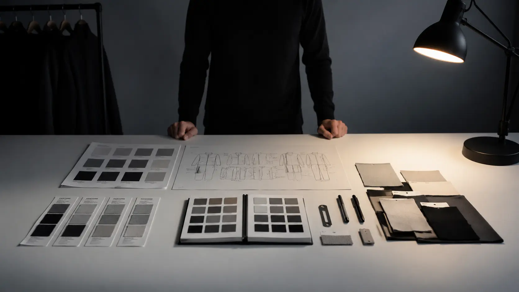
We design an intermediate wall between strategy and execution in this stage. We start testing visual concepts before investing time in detailed design.
This stage consists of three main axes that integrate seamlessly together.
Look And Feel Boards: From Personal Preference To Perception
Mood boards are not just collections of pretty pictures the team likes. They are boards for testing audience perception of the brand.
We gather visual references reflecting the workshop results. These references test the required nature of trust and modernity for the brand.
The client reacts to the visual impression before writing logo ideas. This reduces random revisions in the final stages.
Design Code: Translating Ideas Into Visual Principles
The design code translates strategic ideas into the following visual rules:
| Strategic Concept | Visual Translation | Practical Application |
| :— | :— | :— |
| Customized user support | Organic shapes and slanted lines | Hand-drawn graphics and warm colors |
| Continuous momentum and movement | Arrows and overlapping lines | Motion effects and transparency |
| Reliability and scientific research | Consistent geometric grids | Data cards and editorial layouts |
These principles help test visual metaphors early on. This ensures the design does not stray from its functional goal.
Visual Assets: Guiding Typography, Color, Logo, And Imagery
We start by defining the general frameworks for building core brand elements:
- Typography selection: Determining if it is technical, editorial, or formal.
- Color palette: Distinguishing between following industry colors or breaking away.
- Logo style: Deciding if it is a quiet typographic mark or a flexible symbol.
- Photography direction: Choosing realistic documentary style or process-directed photography.
These constraints protect the designer from getting lost in infinite possibilities. These steps turn the work into a specific and clear path.
How To Prevent Client Rejection Using A Visual Blocklist?
I learned a valuable lesson after managing dozens of studio projects. The best way to protect initial concepts is defining what we will absolutely not do.
I always design a special slide in the presentation called the “visual blocklist”. We list colors, fonts, and visual styles completely rejected by both parties.
In one project, we agreed to avoid the traditional blue used by financial companies. This decision eliminated forty percent of expected traditional options.
This constraint directed the team’s creativity toward a distinct and unexplored visual area. It saved us two weeks of testing repeated solutions.
When the designer knows the field boundaries, they can think with greater freedom and safety. Evaluation becomes based on specific criteria agreed upon previously.
Frequently Asked Questions
What is the pre-concept stage in visual identity design?
It is the space before opening design software, where the team turns brand strategy into visual direction. This stage involves understanding brand context and uncovering hidden stakeholder assumptions. It also turns shared direction into a solid visual foundation before creating concepts. This ensures the design aligns with company goals.
How does defining strategy reduce visual identity design costs?
Precise strategy definition saves companies from expensive revision and rework costs. Visual identity projects usually fail and drain budgets early on when words like “modern” are left undefined. This creates a gap between brand requirements and designer output. It wastes time and money on wrong concepts.
What is the difference between brand strategy and visual identity design?
Brand strategy is the conceptual side defining how the audience should feel about the company and its market values. Visual identity design is the practical translation of that strategy into tangible elements. Simply put, strategy is the meaning, while identity is the visual form conveying that meaning.
How do you turn your brand strategy into a foundation for visual identity?
To start correctly, hold a workshop to define what the audience should believe about the brand. Use visual exercises with stakeholders to uncover assumptions and compare them with competitors. Finally, turn this understanding into clear design principles defining colors, fonts, and logos before actual design begins.
Is relying on general descriptive words safe for ensuring visual identity reliability?
No, relying on general words like “innovative” or “bold” is not safe for building a reliable identity. These words mean different things to everyone. Applying them literally might distance your brand from audience expectations. To ensure reliability, you must deconstruct these words in workshops to link them to market context. This guides the designer toward trust-building solutions.
Turning Strategy Into Visual Reality
The first visual concept is not a dice roll or a theatrical surprise for the client. It is the logical result of organized discussions held during workshops.
Defining visual boundaries in advance protects the designer’s time and the client’s budget. Start your next project by deconstructing general words before drawing any idea.
What is the most confusing word you have encountered in client requirement documents?
Discover more from أشكوش ديجيتال
Subscribe to get the latest posts sent to your email.
![هل يتحول تصميم AirPods بالكاميرات من نكتة لأيقونة؟ [تحليل]](https://hcouchd.com/wp-content/uploads/2026/08/file_0000000041d88230aa3a1289b00f19f3-1024x576.webp)
![أفضل خطوط PowerPoint لتصميم عروض تقديمية احترافية [60 خط]](https://hcouchd.com/wp-content/uploads/2026/08/file_000000008b6481fd91951ad979a42aab-1024x576.webp)
![فخ المسار المهني للمصمم وكيف تكتشف مستواك الحقيقي [تقييم]](https://hcouchd.com/wp-content/uploads/2026/08/file_00000000e36081fd9b5b4daaa467d024-1024x576.webp)