
![أسرار سيكولوجية تصميم UX لخلق بيئة تنافسية صحية [4 مبادئ]](https://hcouchd.com/wp-content/uploads/2026/07/file_0000000025d481f5bae1db61aeea573e-1024x576.webp)
Most interactive platforms create competition that stifles enthusiasm. UX design psychology tells us that ranking users is not motivating. I noticed this pattern in every project. Clients always asked for a global leaderboard. I thought it would spark crazy engagement. Instead, it only sparked user anger and churn. I watched the numbers crash. The platform felt toxic. Users simply stopped logging in.
What actually happens is silent withdrawal. Most users find themselves in low ranks. They feel defeated, not motivated. The design becomes a daily reminder of their inadequacy. They close the app in frustration. This is a massive failure of UX design psychology.
Here, UX design psychology steps in to correct the course. We stopped cramming everyone into a harsh global rank. We started suggesting gentler mechanics. We group users into small, similar skill tiers. We compare today’s performance against yesterday’s. Shifting the metric to personal progress stabilizes usage.
Basics of UX Design Psychology and Guiding Comparisons
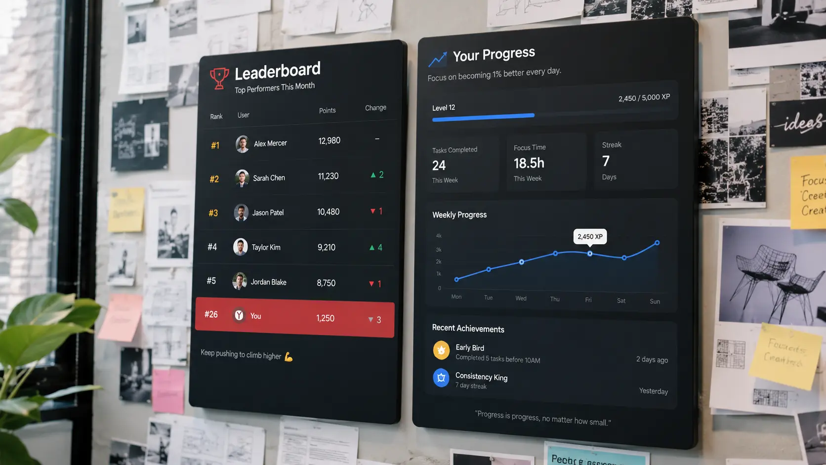
It is not just about ranking names. UX design psychology studies how competition affects user emotions. The difference between enthusiasm and frustration lies in comparison direction.
Understanding the Big-Fish-Little-Pond Effect
Imagine a talented student in a school of geniuses. They quickly feel incompetent. The pond simply grew too big. Educational psychologist Herbert Marsh named this the big-fish-little-pond effect.
In digital design, the opposite happens with massive leaderboards. An average user sees rank 2,341. They feel worthless. Research shows this feeling damages self-confidence. It reduces their ambition.
I studied this across 26 countries. The data included over 100,000 teenagers. Placing a capable person among stronger peers lowers their self-assessment. This is the paradox we face. We want to motivate users, but we frustrate them instead.
Directing User Focus: Upward vs. Downward Comparison
Olympic bronze medalists often look happier than silver medalists. The reason is their chosen comparison. Silver looks at the missed gold. Bronze looks at the empty-handed fourth place. This is counterfactual thinking. A famous study on winner psychology documented this.
As a designer, you can direct focus downward. Show users the distance they covered. In one project, we replaced global ranks with weekly progress. Return rates jumped by 40 percent. We simply showed users their improvement.
This principle changes competitive path design. We focus on the next achievable step. The challenge shifts from impossible to attainable.
Applying Gestalt Principles and Hick’s Law

A healthy psychological environment still needs a smooth interface. UX design psychology offers cognitive tools for seamless experiences.
Using Gestalt Principles to Organize Visuals
Gestalt principles explain how the brain groups similar elements. Grouping related controls reduces effort. Google does this on its homepage. It groups the search bar and buttons centrally. This uses proximity and similarity. Users do not need to think. They find everything instantly. This reduces cognitive load significantly.
In competition, group personal progress metrics together. Visually separate them from global ranks. This softens toxic comparison. It keeps focus on the user’s personal journey.
Controlling Choices via Hick’s Law
Hick’s Law states decision time increases with choices. More choices mean slower, overwhelmed users. Showing 50 challenges paralyzes the user. They do not know where to start.
I used to think more options meant more excitement. Users just left the platform. I advise applying Hick’s Law strictly. Spotify asks new users to pick just three artists. Do the same. Offer only two or three challenges at a time. Make the next step obvious. Guide them gently.
In one app, we limited choices to a daily challenge. We also added a friend comparison. Challenge completion rose by 25 percent. Simplicity is a cognitive necessity.
Engineering Peak and End Moments

Users do not remember every detail. The peak-end rule dictates experience evaluation. They judge based on the sharpest moment and the end. A small victory leaves a lasting impression. A pleasant finish also leaves a lasting impression.
Designing Peak Moments to Prove Competence
Every competition has critical achievement moments. Your job is to amplify these visually. Show a brilliant animation when they beat a record. Celebrate when they reach a new level.
In an educational app, we designed a specific screen. It showed they beat 80 percent of past attempts. Intense visual effects accompanied this. This is not about global rank. It is about beating oneself. This peak moment builds confidence.
Research confirms these moments anchor memory. They become the reference for the whole experience. Do not skimp on designing them.
Ending the Flow Positively
The end is just as crucial as the peak. Duolingo celebrates every lesson completion with fireworks. This leaves a highly pleasant impression. It is a direct application of the peak-end rule.
In competition, users might not win first place. End the experience with a positive message. Progress messages beat low global ranks. Design a warm, encouraging conclusion. Users will return tomorrow.
I tested this on a training platform. We added a daily achievement summary with a celebratory tone. Next-day return rates rose by 18 percent. Small details make a massive difference.
Turning Competition into Sustainable Growth

The ultimate goal is not temporary competition. It is building a long-term user relationship. This requires shifting from absolute ranking to personal progress.
Rewarding Progress Over Final Rank
Traditional leaderboards only reward the top few. This stifles the majority’s motivation. The solution is rewarding progress itself.
Strava added a Local Legend badge. It rewards riding a segment most often over 90 days. Speed does not matter. This shifts competition from absolute skill to consistency. Apply this idea. Reward streaks or relative improvement.
In one project, we awarded badges for personal records. This happened even for users at the bottom. Daily engagement rose by 35 percent. Users felt they were advancing.
Allowing Users to Filter Competitors
The strongest tool in UX design psychology is user control. Do not force global competition. Let them choose their comparison group.
Peloton lets users filter the leaderboard. They can view only their age group. They can race their past self. This simple choice transforms the experience. Frustrated users can shrink the pond.
In a fitness app, we added a toggle. Users could switch between competing with everyone or friends. Seventy percent chose the latter options. Retention rates improved significantly. This relates to probabilistic design. Probabilities give users breathing room.
Lessons from Designing Demotivating Leaderboards
I thought I was a genius. I built my first global leaderboard. Data proved I just repeated the silver medalist’s mistake. Users left after two weeks. We analyzed the numbers. Ninety percent never returned after seeing their low rank.
We redesigned the entire system. We divided users into small weekly leagues. Each league had only 30 people. The top became reachable. We added a personal progress bar. It compared today to yesterday.
The results were shocking. Weekly return rates jumped from 12 to 58 percent. We only changed the measurement metric. This is the core of UX design psychology. It is about how users feel about your product.
The biggest lesson is to doubt your first instinct. Always test. What feels motivating to a designer might be toxic. Data never lies.
Frequently Asked Questions
What is UX design psychology in building user competition?
It means understanding how ranking affects user emotions. Forcing users to compare with the elite causes frustration. Rewarding personal progress provides greater motivation.
Does applying UX design psychology require extra costs?
It does not require huge budgets. It relies on smart design decisions. Providing filters or shifting focus to consistency are cheap tweaks. They multiply user loyalty.
What is the difference between restricted and open competition?
Restricted design shrinks competition to match user ability. Open competition places users in a vast ocean. This makes them feel like frustrated small fish.
How do I apply UX design psychology for beginners?
Direct user focus toward their past achievements. Use activity circles that close with daily personal goals. Make the top spot attainable. Reward tangible progress.
Is a comparison-free environment safe for all apps?
Yes, reducing comparison is a safe approach. Forcing people to compare with the best generates frustration. Giving users freedom to choose their rivals ensures safety.
Final Thoughts
Knowing you are not the best can be fuel. It can also be poison. It depends on your comparison point. Design experiences where users look down at their achievements. Give them control over their competitive pond size.
Have you tried replacing a leaderboard with a progress curve? You might find your users need a mirror. They do not need a race.
Discover more from أشكوش ديجيتال
Subscribe to get the latest posts sent to your email.
![3 مراحل لتأسيس الهوية البصرية من استراتيجية العلامة [دليل]](https://hcouchd.com/wp-content/uploads/2026/08/file_0000000023d8822f8e619d5632f35c74-1024x576.webp)
![هل يتحول تصميم AirPods بالكاميرات من نكتة لأيقونة؟ [تحليل]](https://hcouchd.com/wp-content/uploads/2026/08/file_0000000041d88230aa3a1289b00f19f3-1024x576.webp)
![أفضل خطوط PowerPoint لتصميم عروض تقديمية احترافية [60 خط]](https://hcouchd.com/wp-content/uploads/2026/08/file_000000008b6481fd91951ad979a42aab-1024x576.webp)